How Data Visualization Can Improve Your DRTV Results
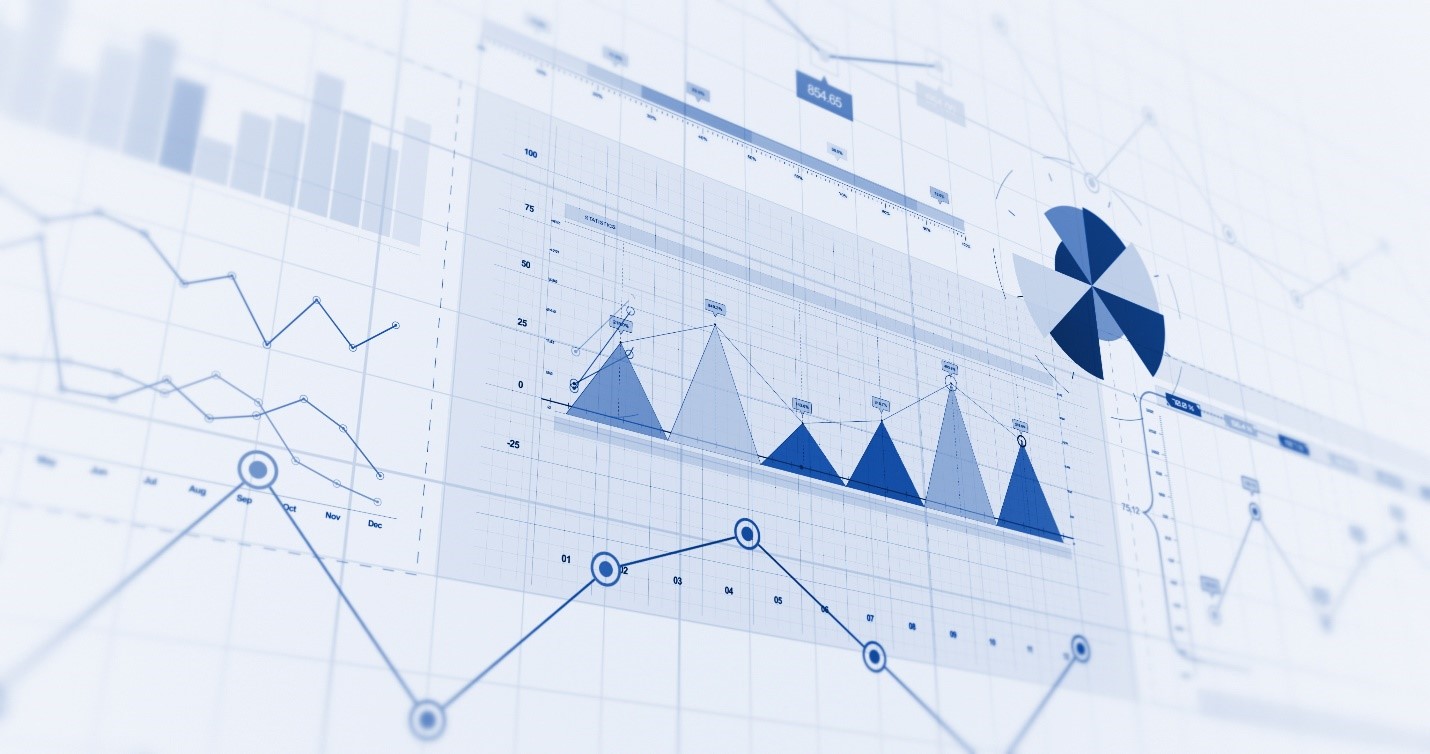
In DRTV, it can be difficult to identify trends when the raw data consists of performance for every airing. Data visualization can turn the raw data into a clear and concise format by grouping data based on the desired level of granularity. Bar charts, line charts, heatmaps, and funnel charts, to name a few, can all be leveraged to identify trends and patterns in the DRTV data. The appropriate visual depends on the metrics used and the insights needed. But when used correctly, these visuals lead to a deeper understanding of the data.
Comparative Analysis & Performance Tracking
Data visualizations allow advertisers to compare how different TV programs, dayparts, creatives, and/or stations perform relative to each other. Analyzing cross-dimensions leads to pinpointing what works and what doesn’t and is more insightful than looking at performance one-dimensionally. Data visualizations make ROI tracking and monitoring performance easy, which in turn enables the advertiser to respond quickly to increase advertising effectiveness.
Storytelling
Data visualizations are powerful tools for storytelling. Well-designed visuals enhance presentations, make them more engaging, and clearly communicate insights. Interactive dashboards also foster exploration and discovery by allowing users to slice and dice the data in whichever way they like. This leads to a deeper understanding of the DRTV data and helps to paint the narrative of overall campaign effectiveness.
Forecasting
Data visualizations can quickly identify trends and patterns in the DRTV data. Historical trends can help to inform future predictions and forecasts, and better prepare for periods of seasonality or holidays when consumer behavior may shift. Data visualizations also aid in evaluating growth and decline as well as evaluating and re-evaluating goals and benchmarks.
Data Visualization Examples
Bar Charts & Line Charts
The most common types of data visualizations are bar charts and line charts. Bar charts represent categorical data where the height or length of the rectangular bars correspond to the value it represents. Bar charts are great for comparing performance side-by-side for creatives, dayparts, stations, etc. Line charts show patterns and trends over time and are the most effective over a continuous interval. By plotting KPIs over a consecutive time period, long-term trends and seasonality can be identified.
Heat Maps
Heat maps use color gradients to represent the magnitude of values in a table. Heat maps are versatile visuals and can be used anywhere from looking at creative performance to geographic analysis and even used to look at ad effectiveness across platforms. By plotting creative performance by station, advertisers can see where different messages perform the best and optimize creative rotations accordingly. This is also effective when looking at creative and station performance by daypart or day of the week. Additionally, heat maps can be used to visualize viewership distribution across DMAs, helping to identify where there are the highest concentrations of the target demographic. They can also be used to analyze TV performance across platforms to assess the overall effectiveness of the TV campaign.
Funnel Charts
Funnel charts are valuable for visualizing the different stages of the conversion process, as well as tracking conversions or drop-off rates each step of the way. Each stage of the process is represented by a separate bar in the funnel, the width of the bar is either proportional to the quantity or a percentage of the whole. By seeing the progression to a conversion event visually, it becomes easy to see the areas that need improvement and optimize accordingly.
Conclusion
Data visualization serves many purposes from ROI tracking to storytelling to forecasting. They promote exploration and discovery and foster a deep understanding of the DRTV data. Data visualizations help the advertiser easily answer any questions they have about the data and be able to make optimizations based on the trends and patterns found. The choice of data visualization depends on the measures used and the desired knowledge, but all can be leveraged to further impact the bottom line.


